
Costco Redesign
Improving Costco mobile app interface design and functionality to enhance membership experience and gain user retention rate.

Role
This was a personal project, where I was a UX researcher and designer seeking to improve the overall user experience of the app.
Duration
2 weeks (Feb 2024)
Overview
While Costco is recognized for its customer service and shopping convenience, its app has encountered difficulties in retaining users and meeting their needs compared to competitors.
I helped redesign Costco’s application to enhance user experience by improving its design and functionality, aiming to simplify product discovery and streamline information access.
Tools
Figma, FigJam
Scope
UI/UX Design, Visual Design, Wireframing, Rapid Prototyping, Competitor Analysis, User Testing
The Problem

While the trend of online shopping has steadily increased throughout the years, Costco app users often encounter challenges when trying to swiftly access product information and plan their trips in advance, which can leave them feeling frustrated with the app.
In the year 2020, Sam’s Club, Costco’s biggest competitor, accumulated approximately 9.6 million downloads among its 47 million cardholder members. In contrast, Costco, with 105.5 million memberships, saw only 4.9 million users add its app. Considering the percentage of downloaded app users, Costco has only 4.65% download rate while Sam's Club boasts a higher adoption rate of approximately 20.43% among its cardholder members. What went wrong?
The Goal & Objectives
To increase Costco user numbers with better visual designs and functionalities.
How Might We’s –
How might we enhance the appeal and functionality of the Costco app to boost download rates among existing Costco members?
How might we ensure a seamless experience on the app that corresponds to the customer in-store experience?
How can we make the app more personalized to inspire users and encourage purchases?
User Research
To understand the users better, I conducted 10 interviews with loyal Costco members who have downloaded their app and engaged in several conversations with casual Costco customers. My objectives were to:
Gather insights into users' perceptions of the Costco app.
Identify the key elements of Costco that loyal users value most (categories, pricing, design, membership benefits, product discovery, etc).
Hence, I went for the Affinity Diagram approach to conduct my user research.
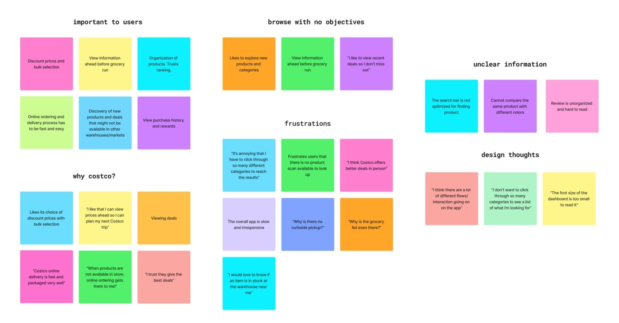
Affinity Diagram
Then, I analyzed three other competing membership online platforms by downloading each app and observing their distinctions through firsthand experiences.
Competitive Analysis

Research Takeaways
Through navigating on the Costco app, reading articles and reddit posts, and talking to other users, I have found the following frustrations within the app:
Explore page is disruptive and overwhelming
The explore page presents a multitude of flyers, overwhelming users with an abundance of information that requires significant time to navigate. Furthermore, the page lacks specificity and categorization, alternating between advertisements, product suggestions, and deals.

The search bar does not allow users to scan product barcodes to read more information. Additionally, when users click on the search bar, it redirects users to another page, disrupting the user flow.
Search bar lacks functionality
Product page lacks seamless navigation

The landing page of the product list contains unnecessarily large buttons and filters, which require users to scroll excessively. When navigating to individual product pages, users find no available information regarding the item's stock status in their nearby warehouse. Moreover, when scrolling down to the reviews section, users encounter numerous redundant buttons and poorly placed UI elements.
When selecting a specific category for shopping, users are prompted to click more than twice to reselect the specific category in order to access the products page.
Lack of Sort and Filtering Function
While one of Costco's core values is putting the customer first, the customer service support is currently hidden under the "Account" tab, making it challenging for users to access help. During user interviews, many users were unaware of this feature within the mobile app.
Hidden Customer Support Access
Translating insights into features
I extracted the pain points and user needs, translating them into potential features. I found out that Costco’s target user seeks for a comprehensive platform, where all products, discounts, and shopping options are available within one place.

Ideation + Prototype


A/B Testing
I experimented with the most efficient ways of grouping the top functionalities, based on the user’s browsing habits. I ran a A/B testing on the home screen to discover which option users prefer the most: get straight into the point of flyers and products or a personalized greeting and quick access to deals.

After conducting a total of 3 usability tests, I concluded that users favored option B primarily due to its personalization and visual clarity.
Final Solution
Incorporating user feedback and identifying key features, I delved into Figma and commenced the redesign process. The redesign aims to provide a more intuitive and seamless checkout experience, facilitating users' navigation during online shopping with Costco.
Efficient Purchasing Flow
Designed for a speedy shopping experience with fast checkout and convenient purchase options, evoking the excitement of purchasing with huge savings.
Enhanced Product Information Accessibility
Multiple features have been added to enhance product information, including in-stock availability in the closest warehouse and various purchase options for customers to choose from. Product details are organized into clear sections for users to expand based on their needs.

Retrospective
I started this case study upon identifying a prevalent challenge related to efficiency in user and shopping experiences while navigating Costco’s app. Given Costco's extensive membership base, designing new features and refining existing screens could significantly enhance user satisfaction during online shopping sessions. I experimented with some Figma micro-interactions and crafted a more intuitive user experience. The core concept revolves around establishing a dynamic platform for Costco members, facilitating a smoother purchase flow, and ultimately driving business objectives and sales.
If I had more time, I would have definitely incorporated the comments from my users to create an even better experience. I would also like additional features, such as scan & go, implementation of pharmacy services, and price comparison tools.
I would want to track metrics such as button clicks, page views, and user engagement to assess the effectiveness of the implemented changes.
Other ways to measure success include:
More user feedback: I want to reach out to more users/customers to understand their frustrations and validate my hypothesis with more A/B testing.
Traffic analysis: how are users interacting with the new categories and filtering buttons?
A/B testing: is the scanning feature really effective in increasing users’ likelihood to repurchase products?